There’s no denying that the past couple of years have been spooky.
Although nobody could have predicted what’s been going on, it’s important to remember the lighter side of horror and prepare for this years’ Halloween festivities in a creative and enjoyable way.
Planning a party? Organising your Trick or Treat route? Or simply designing some Halloween graphics for your website or business? To help you out we have collected a selection of our favourite free assets from across the web to ensure your work is sufficiently spooky.
We all know the classics, (‘Chiller’, for example, has been doing the rounds since 1995 and still gets a lot of use to this day!) but If you are looking for a font to really make your Halloween marketing stand out from the rest, then it might be worth looking further afield.
Here is our countdown of our favourite five terrifying typefaces to give your graphics game a boost.
Like what you see, or think we may have missed something? Let us know your favourite petrifying palette or freaky font in the comments below.
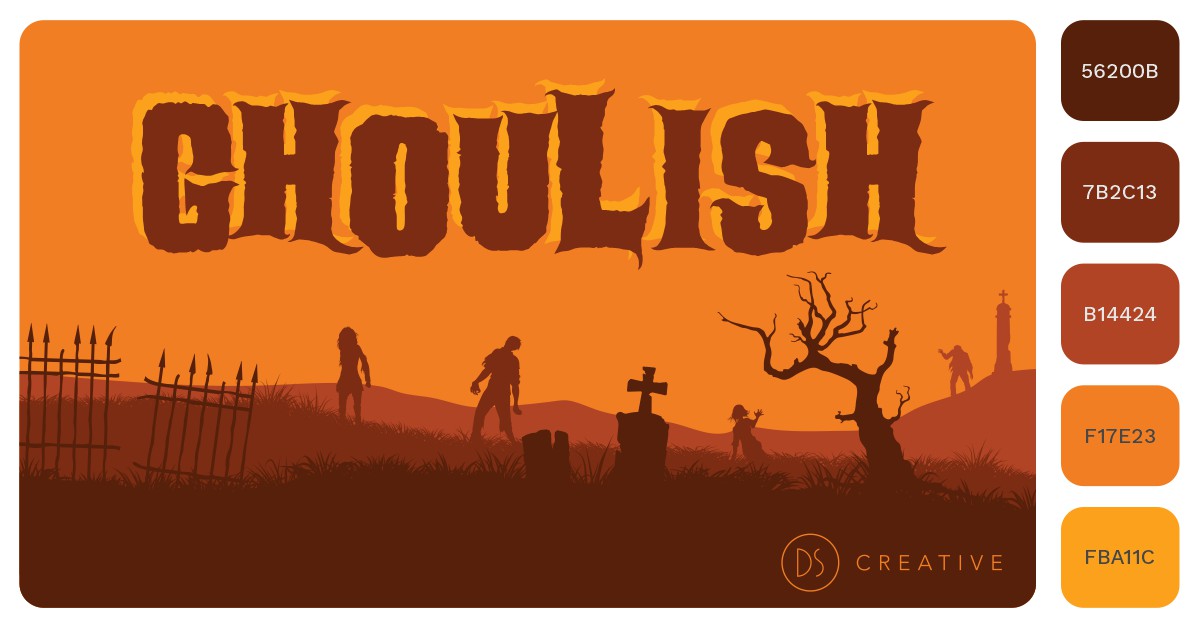
#5 – Ghoulish
Speaking of Ghoulish, let’s start with this beautifully crafted font from Gary Pullin. Taking inspiration from vintage horror movies, this clear and versatile font really makes an impact without overdoing the theme and is perfect for titles or big statements. We have used a range of autumnal oranges here which really accentuates the ‘B-Movie’ feel.
 #4 – Chainsawz
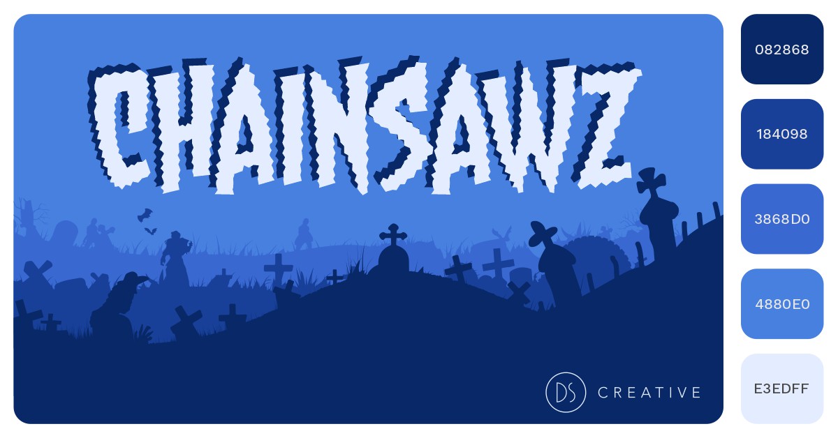
Created by Nate Piekos of Blambot Fonts, ‘Chainsawz’ is a graphic novel influenced typeface which really packs a punch. You can almost hear it! A chilling palette of blues here set a nice background for the standout paler tone.
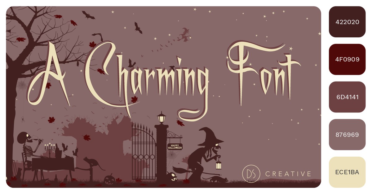
#3 – A Charming Font
For a more elegant and refined look, why not try ‘A Charming Font’ from Gemfonts. Simple and easy to read with just enough sinister connotations to tie in with the seasonal theme. Remember, your colours don’t always have to be bold! These muted tones suggest a faded story book cover.
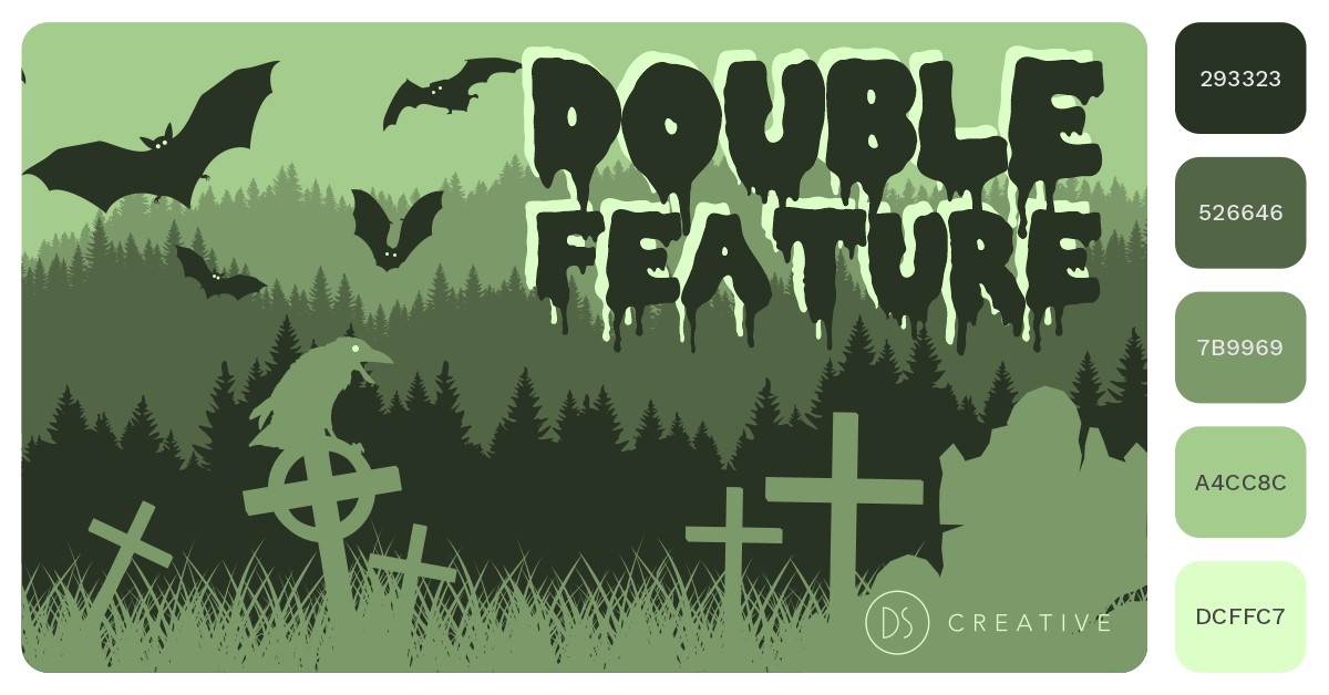
#2 – Double Feature
It wouldn’t be a list of Halloween fonts without at least one example of overly drippy characters! Unlike many similar fonts out there, ‘Double Feature’ maintains its readability while conjuring up images of gore and slime. To compliment this we have gone for some swampy, earthen green tones.
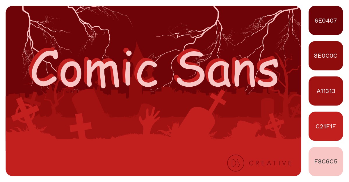
#1 – Comic Sans
Undoubtedly the scariest font on the market. Fill your clients with dread and despair as you hit them with the hauntingly childlike, psychological thriller that is the infamous Comic Sans. Not recommended for public use.

